Blocks
Blocks in the Gutenberg editor are elements you can add into a page in order to create the layout for the content. There are quite a number of blocks available within the Gutenberg editor, and a suite of custom blocks have also been installed with your theme.
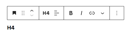
In general, when your cursor is over a block, a hover toolbar will appear and you will be able to adjust various settings & options for that block. This is how it looks like when your cursor is on a Heading block.
Here are some of the more important ones.
Container
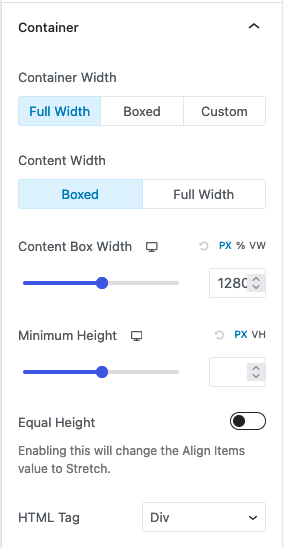
This is the basis of all pages. Think of this block as a “group”. It allows you to set the background colour of the Container, as well as fine-tune padding and margins between this and the next block (which could be another Container block). If the following options don’t show up for you, make sure you select the Container block! You can do so by using the toolbar on the top of the editor.
To ensure that the Container is full width (takes up the entire width of the browser), select “Full Width” and “Boxed”. This ensures consistency with the rest of the section.
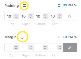
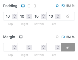
Spacing
You can then adjust the spacing & background of each Container. The following is the default margin & padding; you can select the breakpoint with the icon.
Background
To adjust the background, open up the “Background” menu on the right. There you can select if you want a solid colour, a gradient, or an image as the background. You can then adjust more settings depending on what you select.

Columns & Container
The Columns block allow you to create multicolumn pages. Anytime you see a page with multi-columns in its layout, it is done using the Container block as it offers more customisation, but if you need a simpler block, Columns would suffice.
Once you’ve added it in, you can adjust the amount of columns you want. Generally, the design can accommodate up to 3 columns easily. It is not recommended to use more than 4 columns as each column would then become too narrow. You can control how it behaves responsively by choosing whether it stacks on mobile / on tablet.
Clients Carousel
The Clients Carousel block is just a row of images that animates as the user scrolls. Currently it’s used for clients, but it can be used for anything with a bunch of images.

Each image in the Clients Carousel block is a row on the editor, and can be re-arranged or modified. Hover over each row to add a row above, or remove the current row.
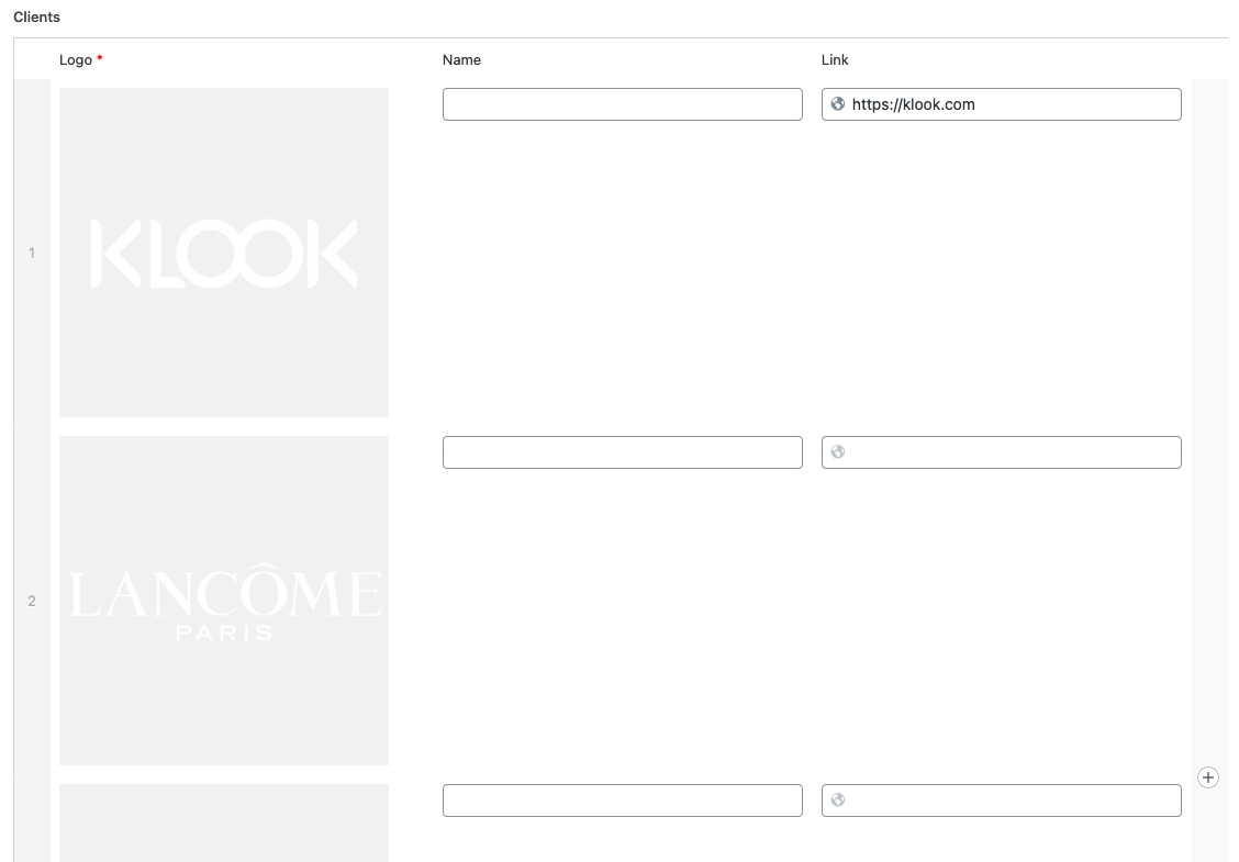
In order to change the logo, hover your cursor over the image and click on the “X” button that shows up on the top right of the image, then add a new image.

Projects Carousel
The Projects Carousel block is a custom block designed to display the projects in a carousel, complete with options for customising the carousel itself, as well as spacing for the block.

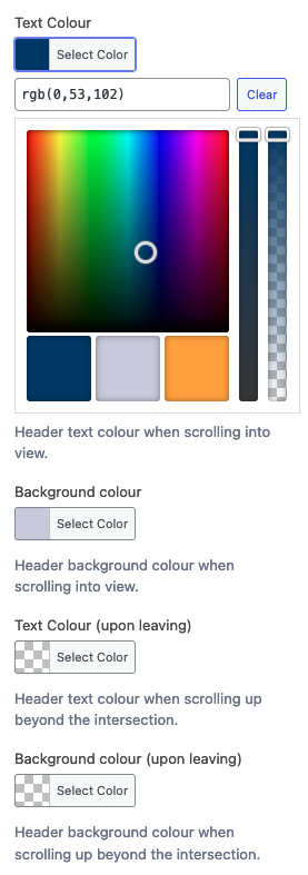
Header Intersect
The Header Intersect block is a helper block that changes header colours when the block itself intersects (touches) the header. This is used to dynamically style the header. The theme colours (blue, lavender and orange) are available for quick selection.
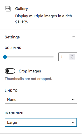
Gallery
You can add a series of images into a “Gallery” block, and specify the layout of the image. Selecting more than 1 column will allow you to put images side by side.
Image
If you only want to add 1 image, you can just use the “Image” block.
Heading
The Heading block allows you to insert “headers”. Headers are text that are bigger and generally bold. To change the various styling of the heading, you can use the toolbar that appears when your cursor is at the heading block.
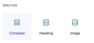
Heading (Spectra)
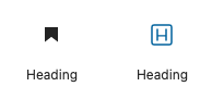
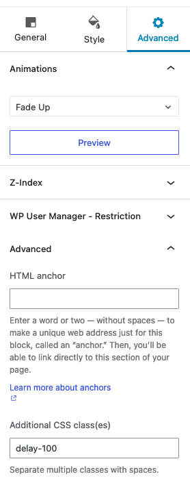
There is another Heading block that is provided by the plugin, Spectra. This Heading block allows you to adjust the settings of the block further. Also, you can set the animation of the heading via the “Advanced” panel on the right of the editor. This block is differentiated from the built in Heading block from Wordpress by its icon; it is a letter “H”.
For the animation, you can actually add a delay by going to Advanced > Advanced and adding “Additional CSS class(es)“.
These are the available classes:
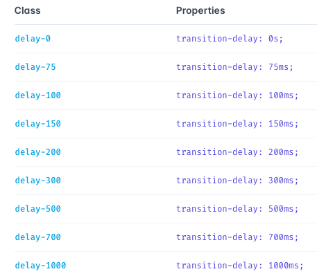
For example, to add a 100ms (0.1 second) delay to the animation, add ”delay-100”, without the quotation marks, to the class.
Post Grid
If you need to include posts, use this to add posts. You can select what type of post you want to include, how many to include, how many columns to display them in, among other settings.

Others
There are actually many blocks provided by the Spectra plugin that are disabled. These can be re-enabled via the admin panel, but they have not been tested with the theme. There are too many to list; check out the “Live Demo” link for a better visual example of each block.